Dynamic squishy responsive css grid layout
A really simple way to get a responsive, css grid without media queries, using ‘css grid’.
You woulnt use this method if you need specific widths for your element. Only use it of your happy to get a fluid width that agjusts to the screen size.
CSS example
Automatically set the min and max size for each column.
1
2
3
4
5
6
.blog-feed__wrapper {
  width: 100%;
  display: grid;
  grid-template-columns: repeat(auto-fit, minmax(250px, 1fr));
  grid-gap: 20px;
}
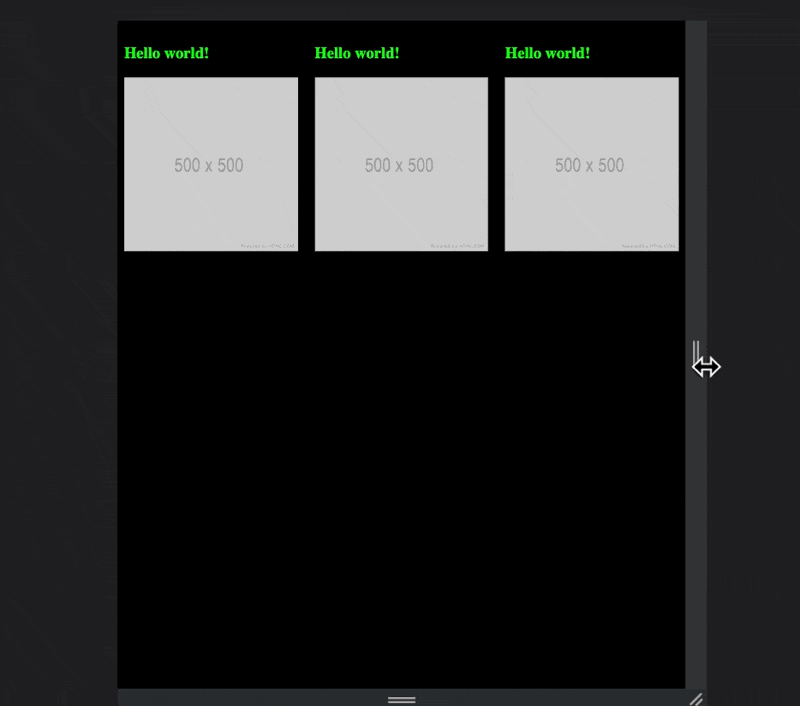
See it in action
HTML example
1
2
3
4
5
6
7
8
9
10
11
12
13
14
15
16
17
18
19
20
21
22
23
24
25
26
27
28
29
30
31
32
33
34
35
36
37
38
<!DOCTYPE html>
<html lang="en">
  <head>
    <meta charset="UTF-8" />
    <meta name="viewport" content="width=device-width, initial-scale=1.0" />
    <title>Document</title>
    <style type="text/css" media="screen">
      .blog-feed__wrapper {
        width: 100%;
        display: grid;
        grid-template-columns: repeat(auto-fit, minmax(200px, 1fr));
        grid-gap: 20px;
      }
      h3 {
        color: lime;
      }
      body {
        background-color: black;
      }
    </style>
  </head>
  <body>
    <div class="blog-feed__wrapper">
      <div class="blog-feed__post-item">
        <h3>Hello world!</h3>
        <img src="500.png" width="100%" />
      </div>
      <div class="blog-feed__post-item">
        <h3>Hello world!</h3>
        <img src="500.png" width="100%" />
      </div>
      <div class="blog-feed__post-item">
        <h3>Hello world!</h3>
        <img src="500.png" width="100%" />
      </div>
    </div>
  </body>
</html>
more info
This post is licensed under CC BY 4.0 by the author.
Comments powered by Disqus.